

文章最后更新时间:2024年04月13日
7、意想不到的内容插入
上述提到::before/::after必须结合content使用,那么content就真的只能插入普通字符串吗?content何止这么简单,以下推广几种少见但强大的内容插入技巧。通过这几种技巧,就能很方便地将读取到的数据动态插入到::before或::after中。
- 内容拼接
- 结合attr()使用
- 结合变量和计数器使用
内容拼接
常规操作是content:"CSS",也可拼接多个字符串,有些同学可能第一时间想起content:"Hello "+"CSS"。拜托,这不是JS而是CSS,CSS字符串拼接当然有自己的规则。CSS字符串拼接既不能使用+相连也可不用空格间隔。
.elem {
    content: "Hello ""CSS"; // 等价于"Hello " "CSS"
    content: "Hello" attr(data-name); // 与attr()拼接
    content: counter(progress) "%"; // 与counter()拼接
}
结合attr()使用
attr()是一个被忽略的选择器,它有着强大的属性捕获功能。有这么一个场景,一个数据集合需遍历到每个DOM上并把某个字段插入到其::after上。这该怎么办,好像95%的同学都不会使用JS获取节点的::before或::after。这时attr()就派上用场了。
<li v-for="v in list" :key="v.id" :data-name="v.name">
li::after {
    content: attr(data-name);
}
一行CSS代码搞掂,还用什么JS去获取节点的::after呢。当然content和attr()的使用场景不止那一点。
:hover作用于鼠标悬浮的节点,是一个很好用的选择器。在特定场景可代替mouseenter和mouseleave两个鼠标事件,加上transtion让节点的动画更丝滑。结合attr()有一个很好用的场景,就是鼠标悬浮在某个节点上显示提示浮层,提示浮层里包含着该动作的文本。
- 给节点标记一个用户属性data-*
- 当鼠标悬浮在该节点上触发:hover
- 通过attr()获取data-*的内容
- 将data-*的内容赋值到伪元素的content上
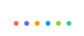
<ul class="hover-tips">
    <li data-name="姨妈红"></li>
    <li data-name="基佬紫"></li>
    <li data-name="箩底橙"></li>
    <li data-name="姣婆蓝"></li>
    <li data-name="大粪青"></li>
    <li data-name="原谅绿"></li>
</ul>
$color-list: #f66 #66f #f90 #09f #9c3 #3c9;
.hover-tips {
    display: flex;
    justify-content: space-between;
    width: 200px;
    li {
        position: relative;
        padding: 2px;
        border: 2px solid transparent;
        border-radius: 100%;
        width: 24px;
        height: 24px;
        background-clip: content-box;
        cursor: pointer;
        transition: all 300ms;
        &::before,
        &::after {
            position: absolute;
            left: 50%;
            bottom: 100%;
            opacity: 0;
            transform: translate3d(0, -30px, 0);
            transition: all 300ms;
        }
        &::before {
            margin: 0 0 12px -35px;
            border-radius: 5px;
            width: 70px;
            height: 30px;
            background-color: rgba(#000, .5);
            line-height: 30px;
            text-align: center;
            color: #fff;
            content: attr(data-name);
        }
        &::after {
            margin-left: -6px;
            border: 6px solid transparent;
            border-top-color: rgba(#000, .5);
            width: 0;
            height: 0;
            content: "";
        }
        @each $color in $color-list {
            $index: index($color-list, $color);
            &:nth-child(#{$index}) {
                background-color: $color;
                &:hover {
                    border-color: $color;
                }
            }
        }
        &:hover {
            &::before,
            &::after {
                opacity: 1;
                transform: translate3d(0, 0, 0);
            }
        }
    }
}
结合变量和计数器使用
现在来玩高级一点的东西,先不做任何铺垫,接着往下看即可,反正就是content结合变量和计数器的使用场景。
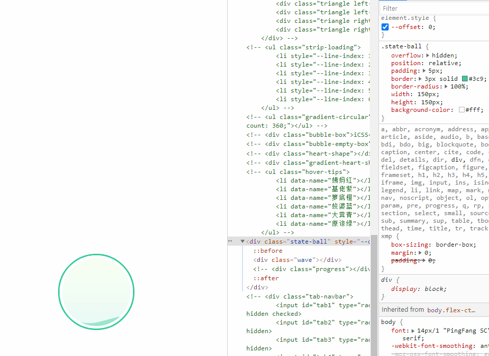
笔者想做一个实时显示进度的悬浮球,跟着笔者一起敲代码吧。先画一个绿油油的波波。
<div class="state-ball">
    <div class="wave"></div>
</div>
.state-ball {
    overflow: hidden;
    position: relative;
    padding: 5px;
    border: 3px solid #3c9;
    border-radius: 100%;
    width: 150px;
    height: 150px;
    background-color: #fff;
    .wave {
        position: relative;
        border-radius: 100%;
        width: 100%;
        height: 100%;
        background-image: linear-gradient(to bottom, #af8 13%, #3c9 91%);
    }
}
进度通常都是从底部往顶部逐渐提升,可用::before绘制一个圆形遮罩层,进度变化时将遮罩层一直往上提升产生障眼效果。提升过程可用绝对定位将遮罩层固定在底部,通过调整margin-bottom平移遮罩层。
为了方便演示,注释父容器的overflow:hidden,通过Chrome Devtools微调margin-bottom看看整体效果。后续记得将overflow:hidden声明回来。
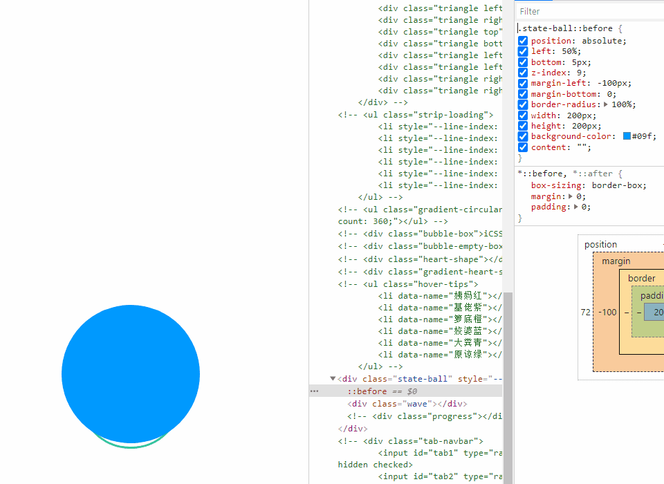
.state-ball {
    // overflow: hidden;
    // ...
    &::before {
        position: absolute;
        left: 50%;
        bottom: 5px;
        z-index: 9;
        margin-left: -100px;
        margin-bottom: 0;
        border-radius: 100%;
        width: 200px;
        height: 200px;
        background-color: #09f;
        content: "";
    }
    // ...
}
为了让提升过程呈现动态效果,调整::before的背景颜色和圆角率并追加一个旋转动画。
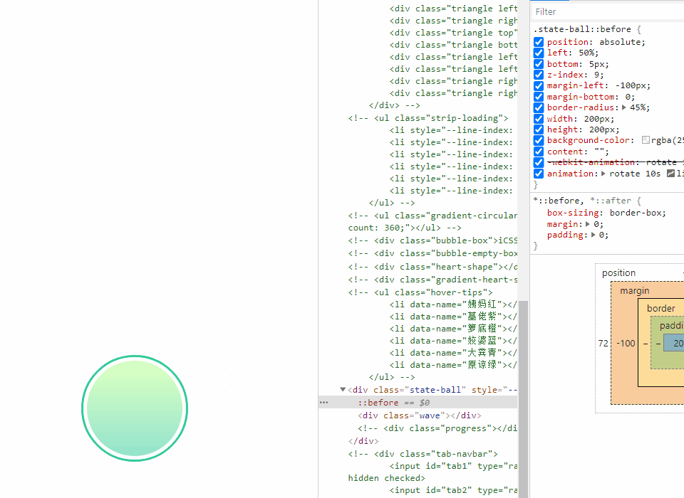
为了让波浪呈现立体效果,追加::after占位并声明整体样式与::before一致,在背景颜色、圆角率和动画时延上略有差异即可。另外声明::after的margin-bottom稍微比::before高一点,这样在旋转过程中能让波浪产生动态的立体效果。
在提升过程中,两个遮罩层位移距离应该是一致的,所以可用变量计算公式表示且::after比::before高10px。在这里有个值得注意的地方,若变量结合calc()使用,其结果必须带上单位,以这两条公式为例,其变量初始值必须为--offset:0px,不能为--offset:0。
- ::before:margin-bottom:var(--offset)
- ::after:margin-bottom:calc(var(--offset) + 10px)
<div class="state-ball" style="--offset: 0px;">
    <div class="wave"></div>
</div>
.state-ball {
    // ...
    &::before,
    &::after {
        position: absolute;
        left: 50%;
        bottom: 5px;
        z-index: 9;
        margin-left: -100px;
        width: 200px;
        height: 200px;
        content: "";
    }
    &::before {
        margin-bottom: var(--offset);
        border-radius: 45%;
        background-color: rgba(#fff, .5);
        animation: rotate 10s linear -5s infinite;
    }
    &::after {
        margin-bottom: calc(var(--offset) + 10px);
        border-radius: 40%;
        background-color: rgba(#fff, .8);
        animation: rotate 15s infinite;
    }
    // ...
}
// ...
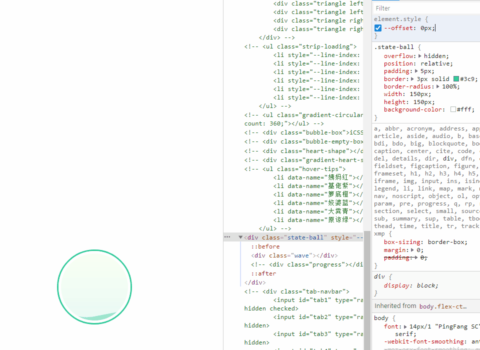
到此再优化一些细节,通过Chrome Devtools检查.wave得知其尺寸为134x134,每次往上平移两个伪元素只能1px那样递增。现在想将其平移100次就能填充整个球体,那么就需按照134/100这个比例改造变量计算公式。
将--offset声明为--offset:0,取值区间在0~100而不是0px~100px。
- ::before:margin-bottom:calc(var(--offset) * 1.34px)
- ::after:margin-bottom:calc(var(--offset) * 1.34px + 10px)
<div class="state-ball" style="--offset: 0;">
    <div class="wave"></div>
</div>
.state-ball {
    // ...
    &::before {
        margin-bottom: calc(var(--offset) * 1.34px)
        // ...
    }
    &::after {
        margin-bottom: calc(var(--offset) * 1.34px + 10px);
        // ...
    }
    // ...
}
// ...
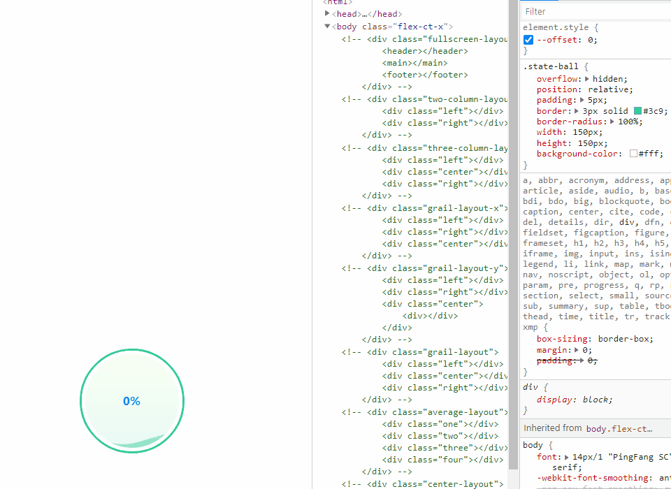
现在已把位移距离控制在0~100的比例了,那么剩下步骤就是追加一个<div>,使用其content存放在offset实时显示进度了。
<div class="state-ball" style="--offset: 0;">
    <div class="wave"></div>
    <div class="progress"></div>
</div>
.state-ball {
    // ...
    .progress::after {
        display: flex;
        position: absolute;
        left: 0;
        top: 0;
        z-index: 99;
        justify-content: center;
        align-items: center;
        width: 100%;
        height: 100%;
        font-weight: bold;
        font-size: 16px;
        color: #09f;
        content: var(--offset) "%";
    }
}
// ...
可是发现无任何文本效果。情况是这样的,若变量是字符串类型可直接显示,若变量是数值类型则需借助counter()显示。而counter()还需使用counter-reset初始默认值,CSS计数器怎样用在这里就不讲解了,感兴趣的同学可自行百度。
整体改造工程就这样完成了,完整代码如下。最后通过JS操作变量--offset就能实时改变进度了。
<div class="state-ball" style="--offset: 0;">
    <div class="wave"></div>
    <div class="progress"></div>
</div>
.state-ball {
    overflow: hidden;
    position: relative;
    padding: 5px;
    border: 3px solid #3c9;
    border-radius: 100%;
    width: 150px;
    height: 150px;
    background-color: #fff;
    &::before,
    &::after {
        position: absolute;
        left: 50%;
        bottom: 5px;
        z-index: 9;
        margin-left: -100px;
        width: 200px;
        height: 200px;
        content: "";
    }
    &::before {
        margin-bottom: calc(var(--offset) * 1.34px);
        border-radius: 45%;
        background-color: rgba(#fff, .5);
        animation: rotate 10s linear -5s infinite;
    }
    &::after {
        margin-bottom: calc(var(--offset) * 1.34px + 10px);
        border-radius: 40%;
        background-color: rgba(#fff, .8);
        animation: rotate 15s infinite;
    }
    .wave {
        position: relative;
        border-radius: 100%;
        width: 100%;
        height: 100%;
        background-image: linear-gradient(to bottom, #af8 13%, #3c9 91%);
    }
    .progress::after {
        display: flex;
        position: absolute;
        left: 0;
        top: 0;
        z-index: 99;
        justify-content: center;
        align-items: center;
        width: 100%;
        height: 100%;
        font-weight: bold;
        font-size: 16px;
        color: #09f;
        content: counter(progress) "%";
        counter-reset: progress var(--offset);
    }
}
@keyframes rotate {
    to {
        transform: rotate(1turn);
    }
}


还没有评论,来说两句吧...